4month case study for an android app
BeKiyo
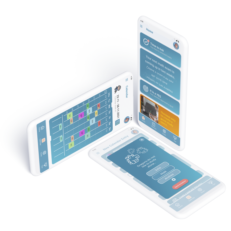
BeKiyo is designed to reduce stress and enhance the well-being of students, parents, and teachers by providing an organized and playful calendar for managing school tasks.
#start
Problem
- "Many students encounter the challenge of managing their needs, desires, and responsibilities (tasks) after school and require assistance in establishing a solid study-life balance."

#approach
Solution
- "Designing an app that assists students in better organizing their workload and offers valuable study techniques to foster a comfortable and stress-free study experience."
#2
Initial Goal
„When I started the project, I was not really sure where it would take me. I felt quite confident about the issue I wanted to tackle – reducing stress in students (aged 10-18).
But at that point, I did not really know what the pain point of this young generation was.
Although I was able to find some blogs and articles on the subject, there was no web service or application that addressed my demographic as a whole.“
- Reduce the stress of studying

#3
User Interviews
I began conducting in-person user interviews with students. The outcomes of these interviews proved to be quite enlightening, as they validated the core assumption.
Numerous students had experienced significant stress levels in the past, and the majority had encountered challenges before discovering effective learning techniques. (Some were still grappling with these challenges.)
While some managed to create study groups with their friends, others had to discontinue their schooling due to the stress. Despite the diverse solutions, the recurring theme was the difficulty in establishing a successful study routine.
- Organising their homework is a stressful task for most of the students.
- Finding a suitable way to study was difficult for many of them.
#4
Affinity mapping
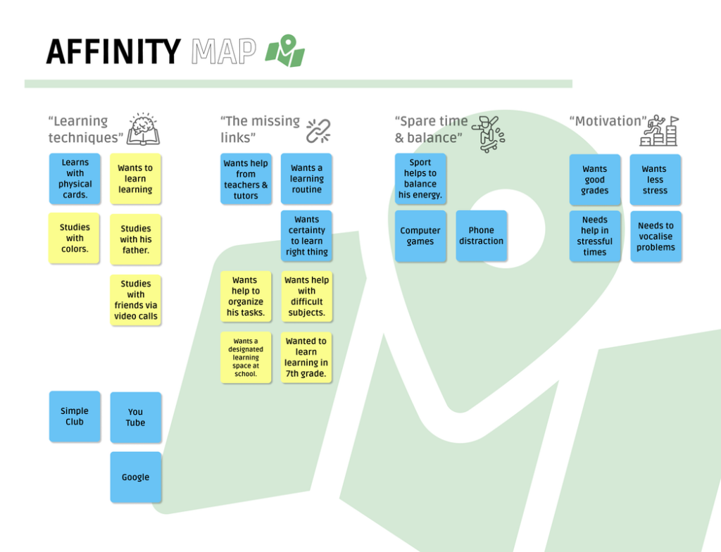
In an effort to organize my findings, I generated an affinity map to gain a clearer understanding of the key aspects that the application needed to tackle.
- These are the 4 main assessments of the affinity map
- Learning techniques
- The missing links
- Spare time & balance
- Motivation
- I decided to concentrate on two key areas: enhancing student learning techniques and addressing their universally mentioned need for support during interviews.
#5
Personas
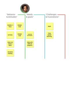
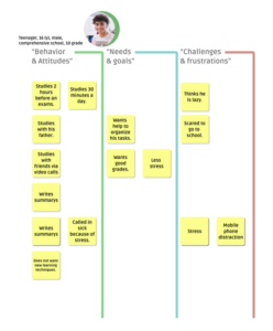
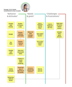
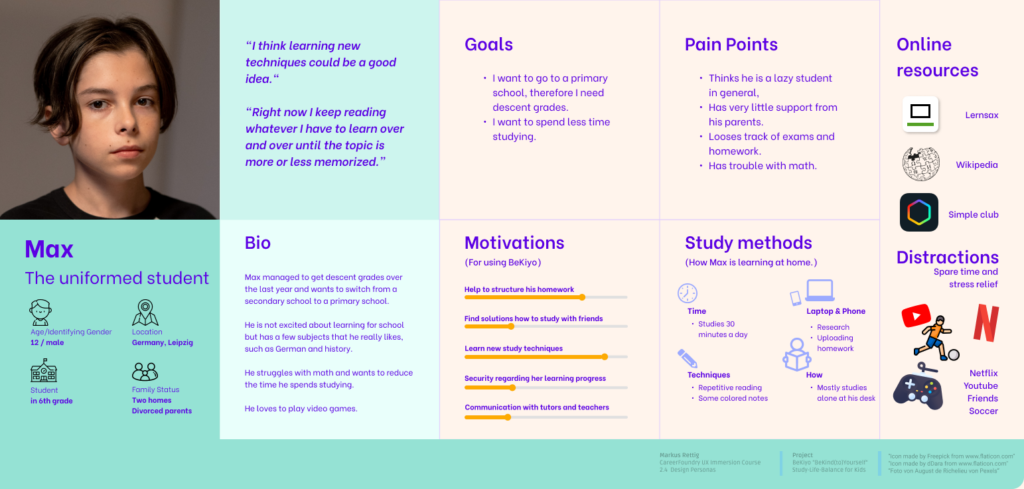
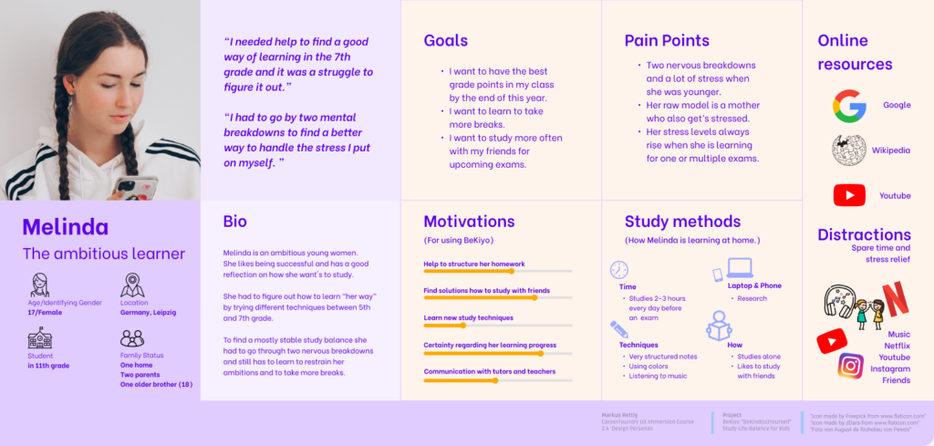
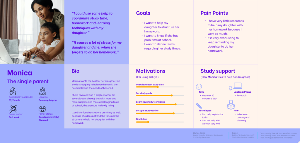
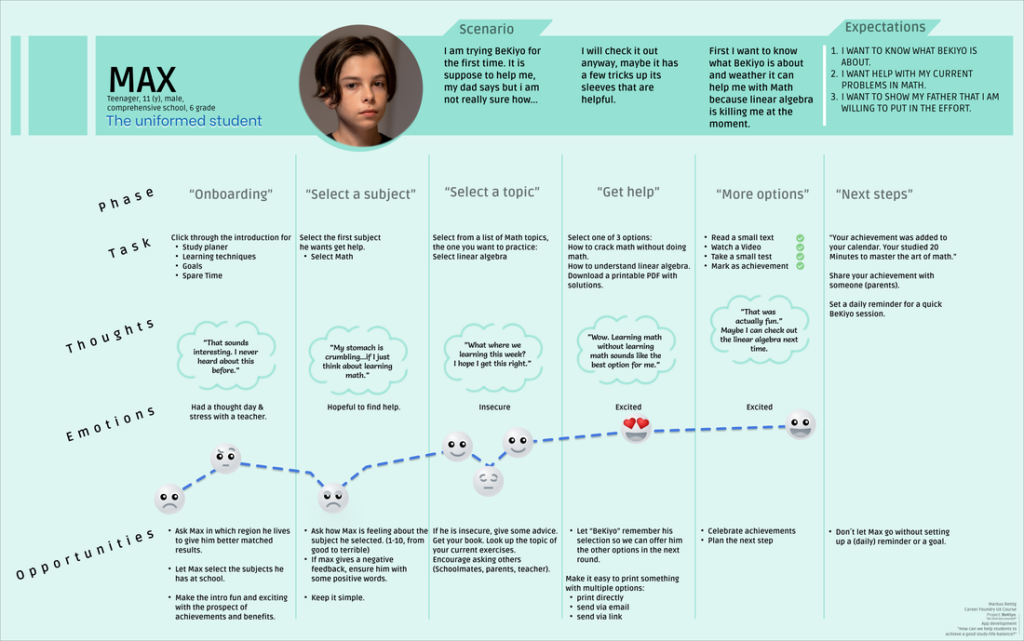
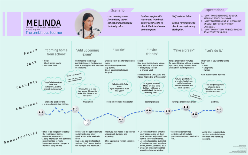
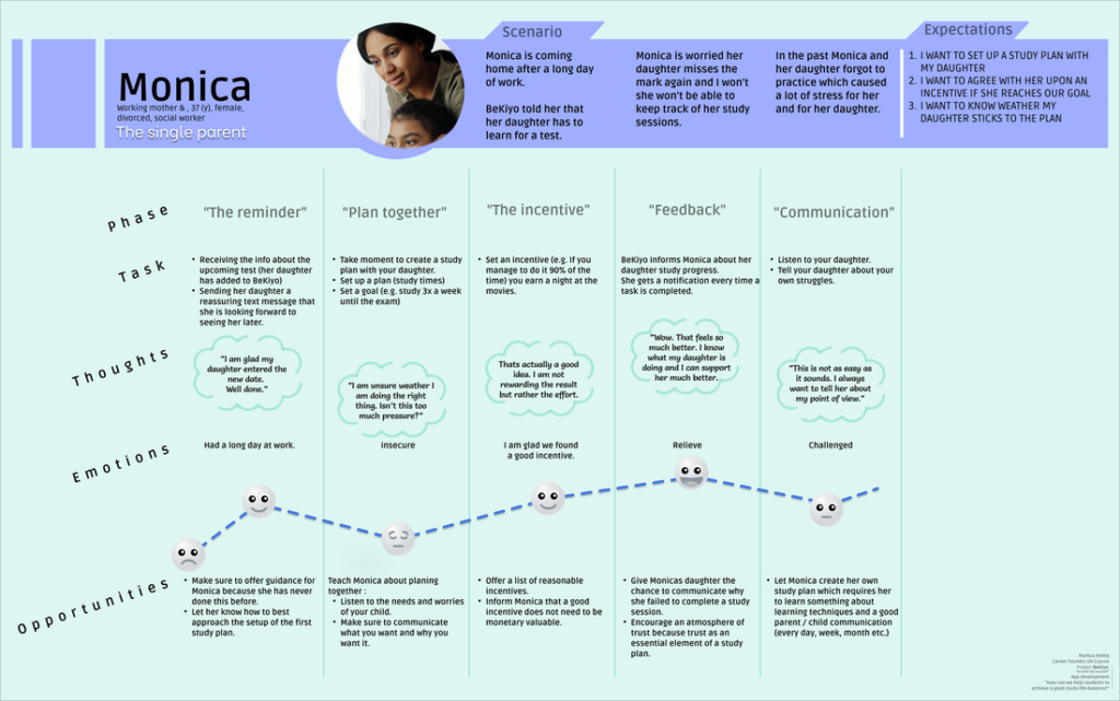
In designing this app, it’s essential to understand the target audience. BeKiyo’s mission is to assist students in overcoming their challenges, so I have developed three distinct personas: Melinda, Max, and Monica. These personas represent both students and parents, aligning with my goal to provide support and solutions to both groups.
- The uninformed student
- The ambitious student
- The single parent
-
"However, having parents on my radar helped me to design the app in a more holistic way, and adding parents later in the process did not feel like an afterthought, but rather a natural evolution of the service."
#7
Mental Models
After creating the personas, I moved on to outline how BeKiyo could effectively meet the requirements of these personas. To achieve this, I formulated mental models, offering valuable insights into the potential challenges our personas might face.
- The main pain points & possible solutions:
- The feeling of being lost // Finding help when an issue or task is difficult.
- Invisible successes // Making successes visible.
- Difficulty keeping track // Help with organising tasks.
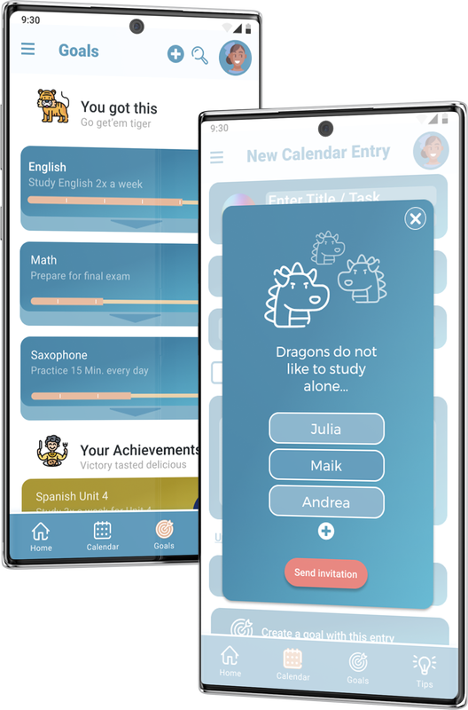
- Feeling alone // Encourage joint study sessions.
To Succeed – To accomplish something desired or intended.
#8
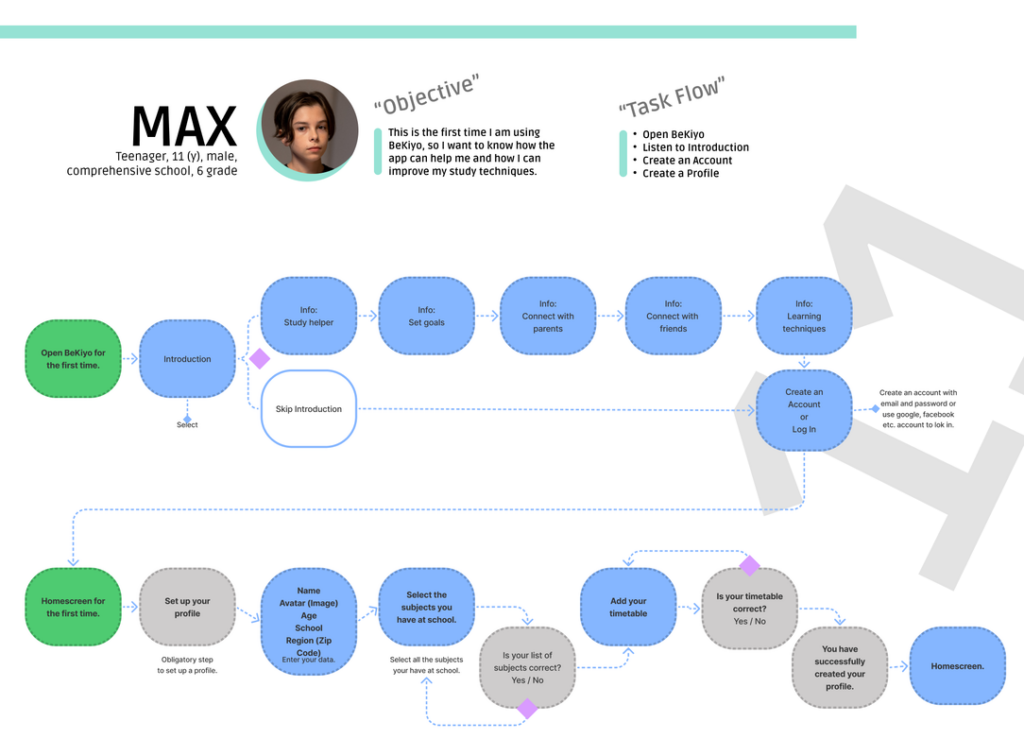
User Flows
Taking a systematic approach, the user flows guided me in leading users through the key interactions I aimed for them to engage in or the tasks I intended for them to complete. This approach enabled me to identify issues in BeKiyo’s overall structure before investing excessive time in building a non-functional prototype.
Over time, I made adjustments to these user flows to ensure their natural evolution as the project advanced.
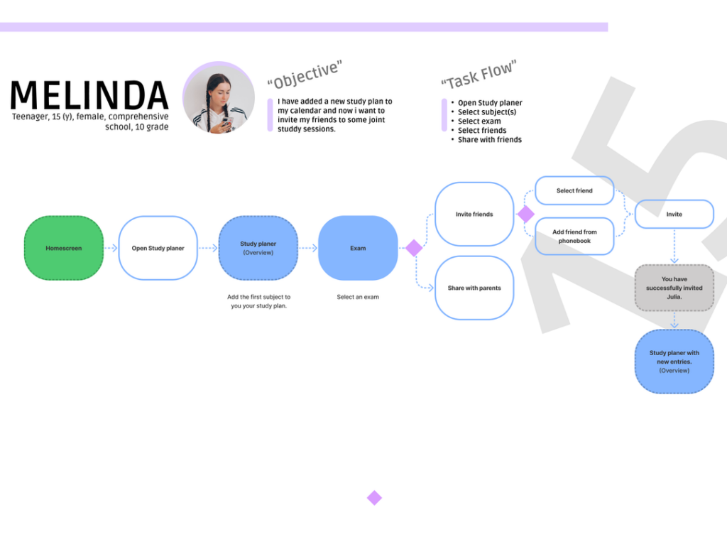
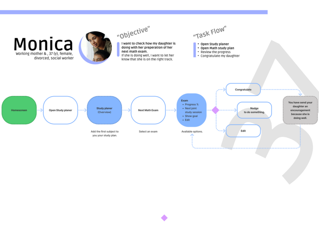

The direction
It was at this juncture that the project’s direction and approach were solidified. All my research and analysis converged on three fundamental elements of BeKiyo.
- Three key elements that BeKiyo should prioritize.
- Optimized organisation techniques
- Support of participatory learning
- Finding the right learning techniques for each student
#9
Wireframes
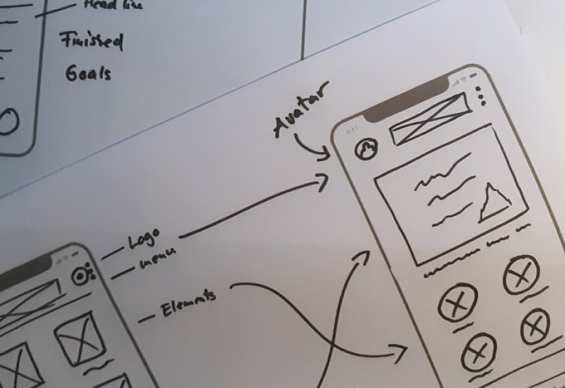
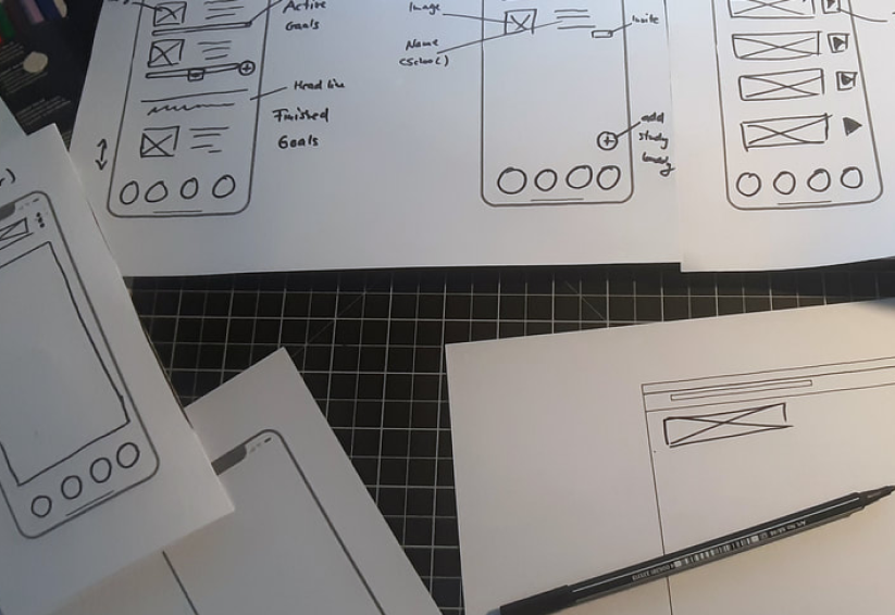
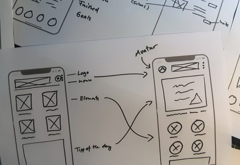
Developing the initial wireframes breathed life into the concept, allowing me to outline the interactions between the core pages of the application.
Nonetheless, it was crucial to maintain simplicity during this stage, concentrating more on the functionality of the pages and their elements, and less on the styling aspects.
-
The wireframes define the following:
- The header menu
- The tap menu at the bottom
- The structure of the page
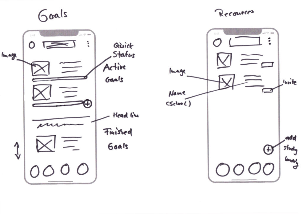
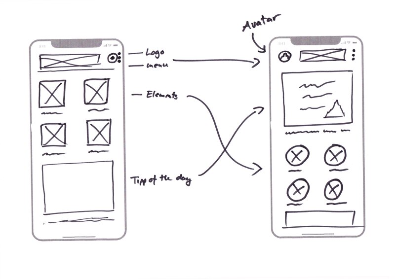
#10
Mid Fidelity-Prototyp
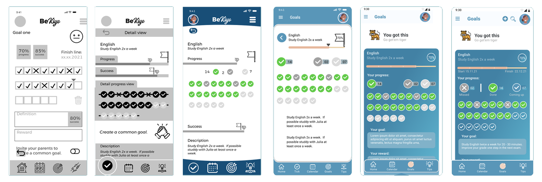
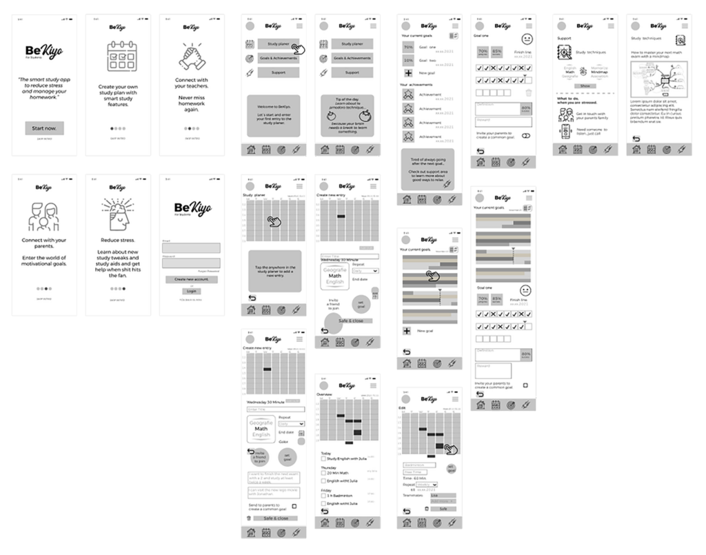
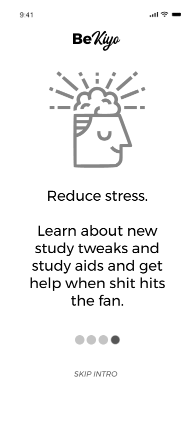
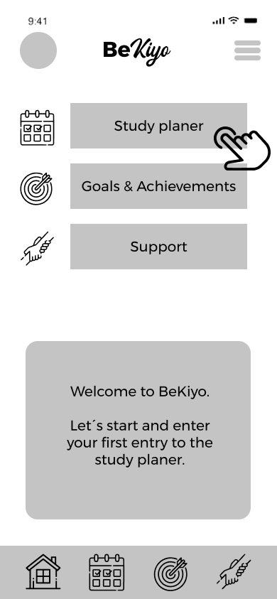
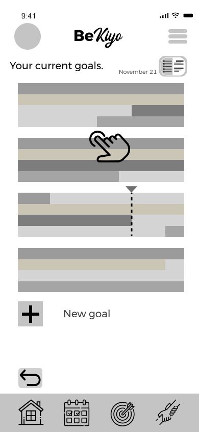
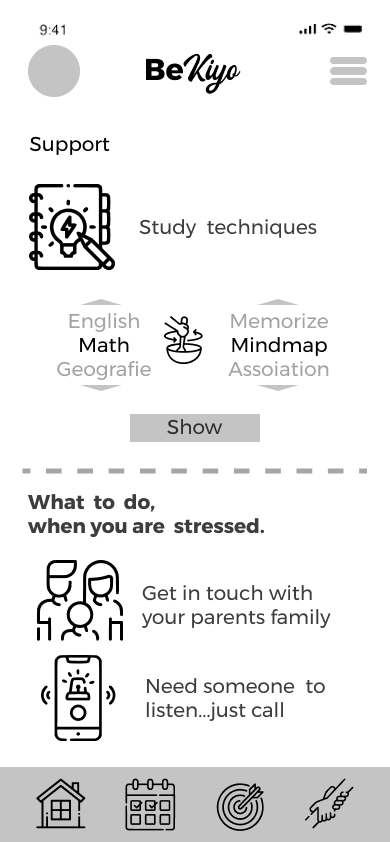
Once the sketching phase was completed, I advanced by developing a series of low and mid-fidelity prototypes that encompassed the fundamental functionalities of BeKiyo.
During this project phase, I transitioned to using Figma as my primary prototyping tool. The initial prototype enabled me to persist in refining navigation and interaction.
At this point, I gave minimal consideration to styling and color schemes.
This prototype facilitated the integration of all the hypotheses and discoveries I had accumulated up to this point, and it also enabled me to conduct the initial user test.
Struggle – To proceed with difficulty or with great effort.
#11
Iterations
Throughout the project, the prototype continuously improved, progressing from mid-fidelity to high-fidelity. This evolution involved conducting usability tests, both in-person and via video calls, as well as AB preference tests using usabilityhub.com.
- The main challenges at this stage:
- Deciding how much information is too much.
- Selecting a suitable color scheme.
- Selecting relevant feedback and recommendations.
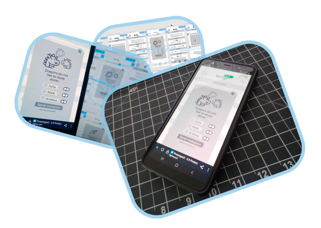

Iterations for Prototype 0.1 included a decision to limit the color palette for a more consistent appearance.
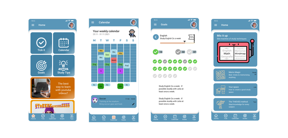
Iterations for Prototype 0.2 involved adopting a color palette with a greater emphasis on blue shades, inspired by Android’s material design.
#12
Style Guide & Design System
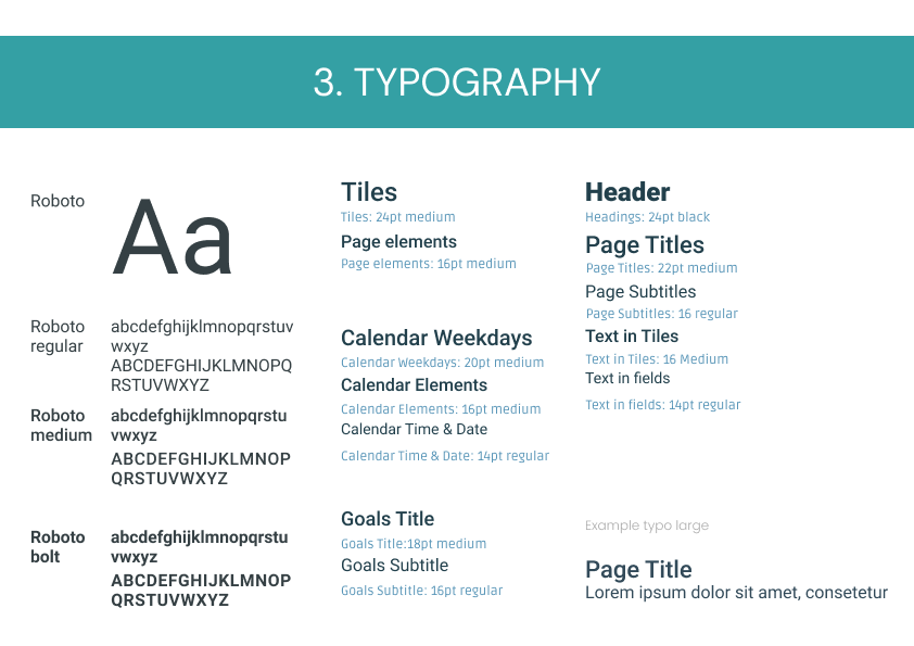
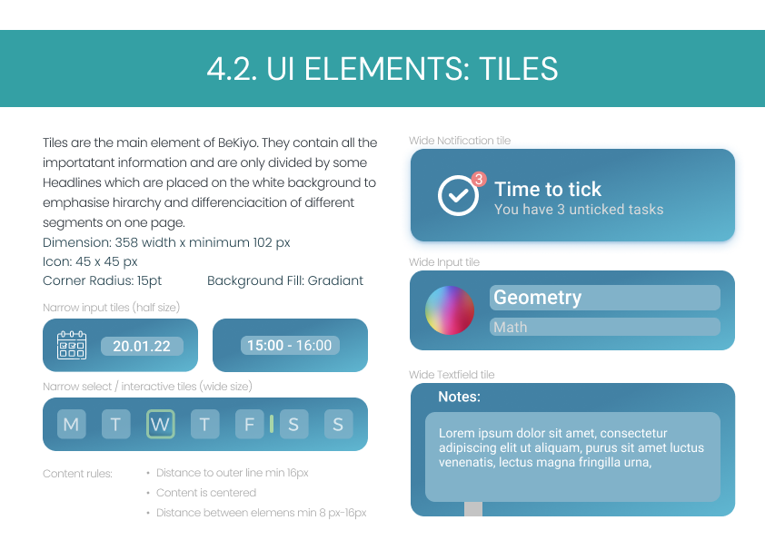
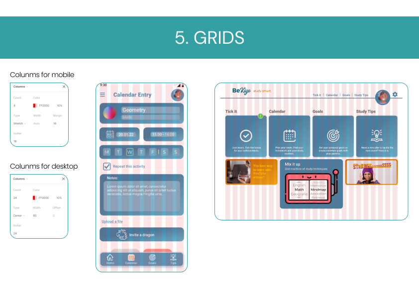
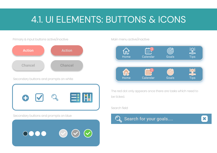
Developing the style guide for BeKiyo underscored the significance of maintaining consistency across the app. Borders, spacing, colors, and fonts all needed to adhere to established guidelines to craft a seamless user experience.
Once the style guide was established, I proceeded to develop the high-fidelity prototype.
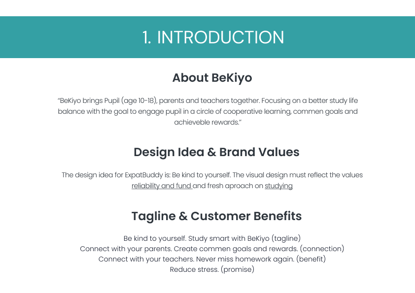
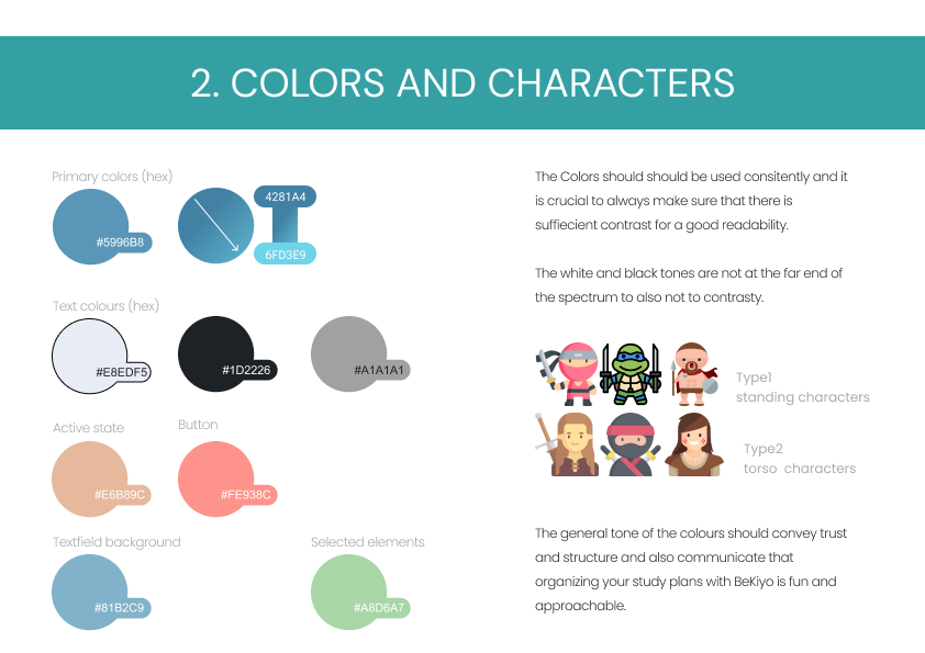
Goal – The terminal point of a journey or race.
#13
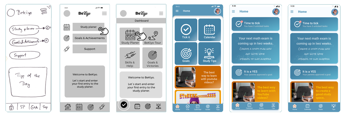
From low to high fidelity
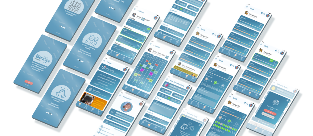
The initial static start screen transformed into a dynamic feed-based interface that adapts its appearance according to the latest and forthcoming tasks and achievements.
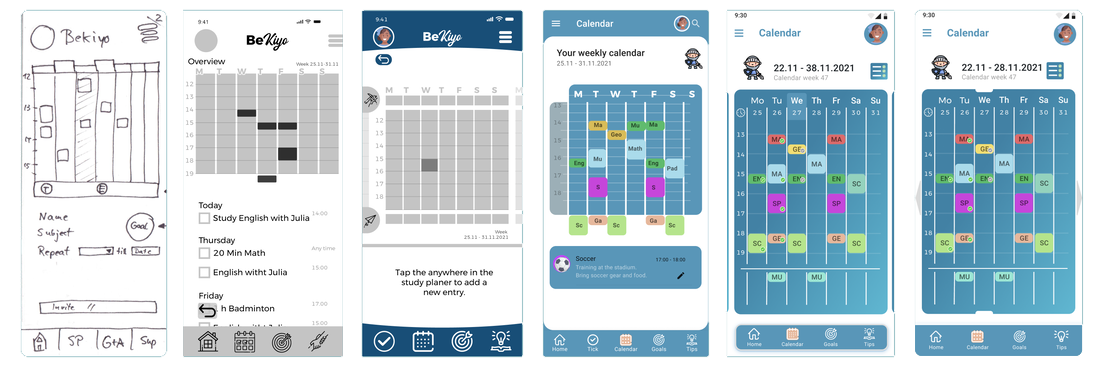
The calendar underwent numerous iterations to discover the optimal method for presenting weekly tasks with the appropriate size and color. Additionally, it aimed to find a solution for displaying detailed information, eventually settling on a separate page as the final solution.
The „goal view“ transitioned from a full-page element to a expandable/collapsible tile. Ensuring clear progress display was a critical challenge, as the earlier version proved difficult for participants to grasp. In the final version, the right hierarchy and logic were established to make it function effectively.
#15
Ways to improve
- If I could revisit this project and make changes, my primary aim would be to place a stronger emphasis on one user group (the students) a bit earlier in the process.
- I underestimated the complexity of the calendar feature, which could have been a project on its own. I would have prioritized achieving a more comprehensive solution for the calendar over, for instance, the additional 'tips' section.
- Another aspect is the early adoption of a design kit and the earlier emphasis on constructing a robust design system. Introducing these elements later in the process necessitated some additional working hours. 😉
Next steps
- Initiate another round of user testing with 3-5 participants to gather further insights on the current usability.
- Emphasise on interactions with the calendar, specifically refining how entries are created and edited.
- Furthermore, the connection between the calendar and the goals requires additional fine-tuning to streamline the process of creating and editing new goals as seamlessly as possible.
httpsde.freepik.comfotosschuleSchule Foto erstellt von stockking – de.freepik.coma
httpsde.freepik.comfotosbildung’Bildung Foto erstellt von freepik – de.freepik.coma
httpsde.freepik.comfotosschuleSchule Foto erstellt von stockking – de.freepik.coma
Tools Used for this case Study
